01
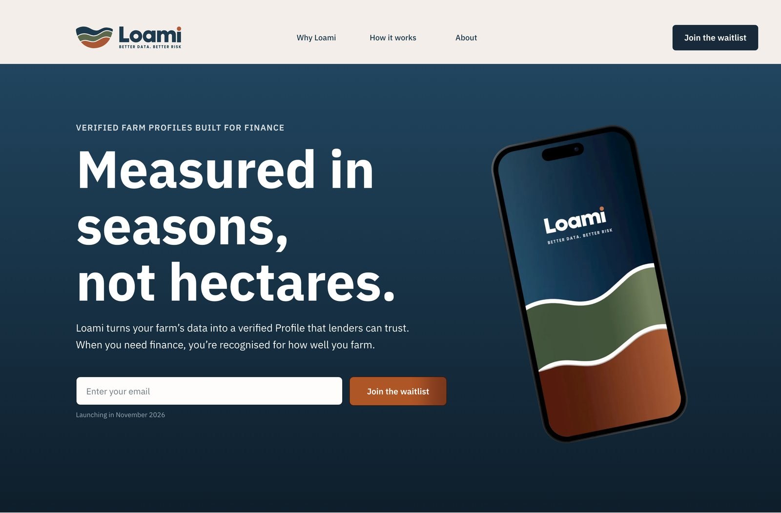
One promise, one action
The first screen says what Loami is in a single line, explains the benefit in plain words and puts the waitlist form right there, so nobody has to look for what to do next.
A launch website for a farm-finance platform. Farmers needed plain words and a reason to trust it; lenders needed proof. The site does both, and points everyone to one clear next step: join the waitlist.
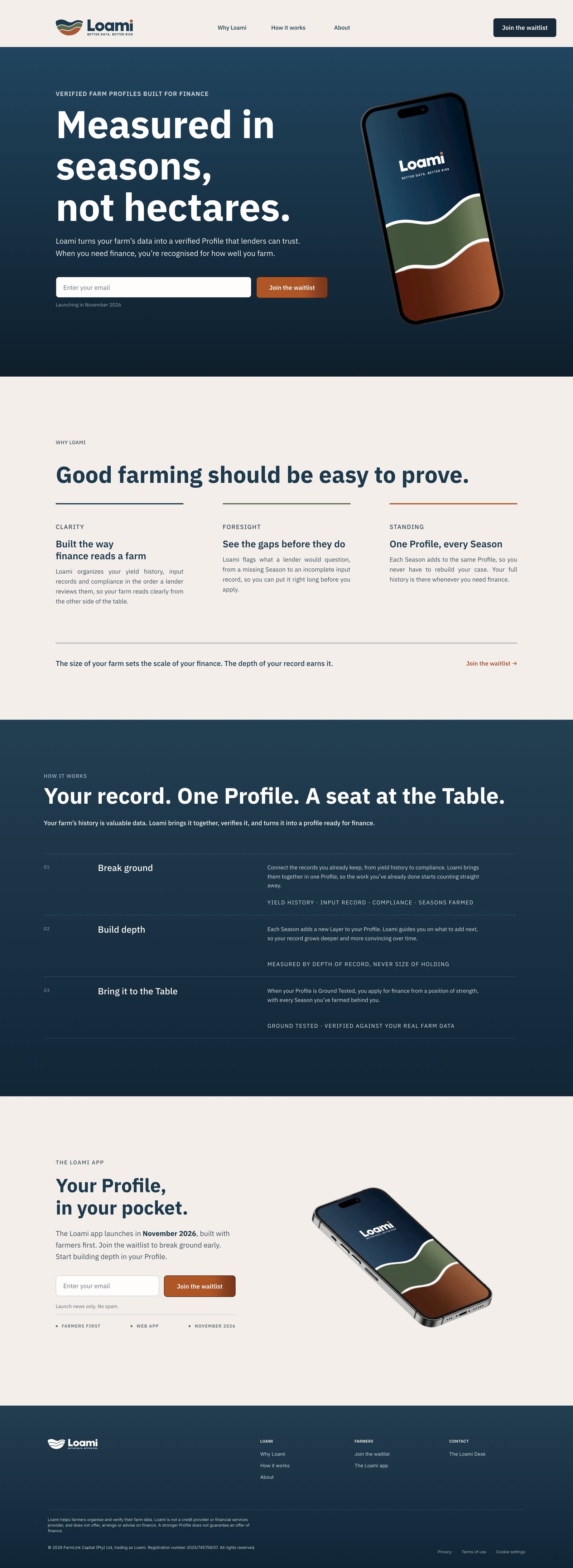

Scroll inside the screens to see the whole siteDesktop and mobile
How the homepage takes a visitor from first glance to signing up.
The first screen says what Loami is in a single line, explains the benefit in plain words and puts the waitlist form right there, so nobody has to look for what to do next.
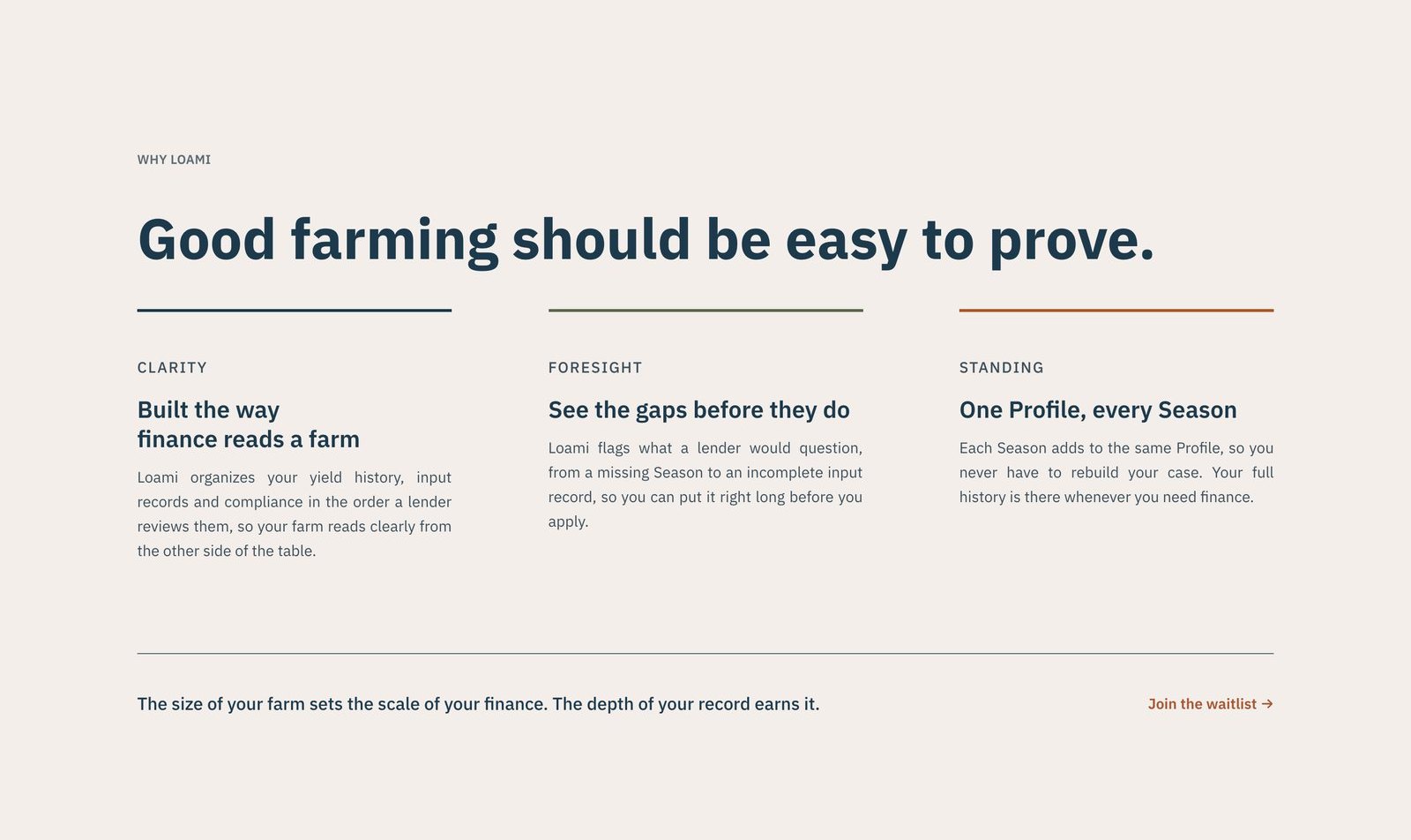
Before explaining features, the page names the problem farmers already feel: good farming is hard to prove to a lender. Three short points show how Loami changes that.
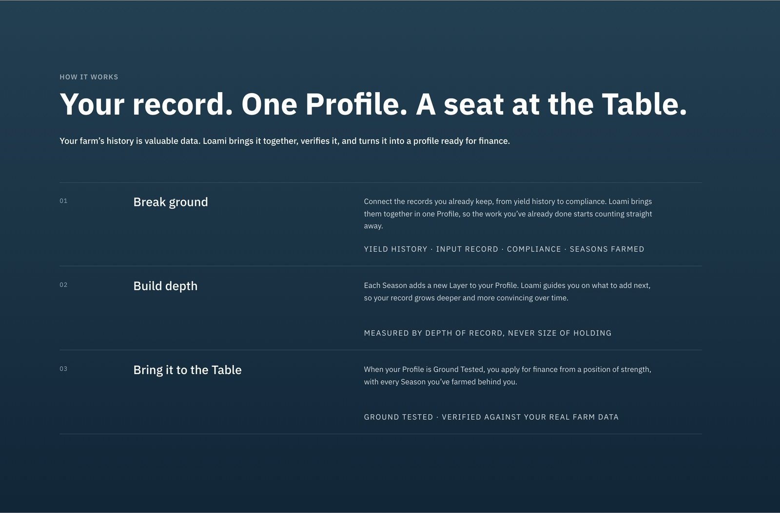
How it works is three clear steps on a calm dark background, so a new idea feels easy to follow and the brand’s confidence comes through.

The app section gives a date to look forward to and a second chance to join the waitlist, so the page ends on the same single action it started with.